This page contains affiliate links to trusted retailers. I may earn a commission when you purchase through these links, at no additional cost to you. As an Amazon Associate I earn from qualifying purchases. As an Walmart Partner I earn from qualifying purchases.
Colored pencils vary considerably even within the same brand. Pigment load, filler content, binder formula, opacity, value, and best handling practices can change from color to color.
Let’s test one of Prismacolor’s pink pencils:

Bubble Gum & Barbie
Prismacolor makes a lovely assortment of reds and magentas, so it’s rather frustrating how few light reds and light magentas they make to go with them.
Hot Pink 993 was introduced in the 1990’s, a welcome and necessary addition to the family…
And yet…
I’m sorry to admit this…
I almost never use this pencil. Learn why below.
Prismacolor Premier: Learn about the pencil line, sets, and how Prismacolor colors compare.
The Color: Prismacolor Hot Pink 993
Name: The name “Hot Pink” became popular in American fashion during the 1950s, but its history goes back to the 1930s, when designer Elsa Schiaparelli made Shocking Pink her signature color. Her magenta-pink was a dramatic departure from the gentle pastel pinks fashionable at the time.
Temperature: Prismacolor’s version of Hot Pink is a cool light magenta. I’d describe this as a fairly balanced magenta, there are no noticeable notes of blue or purple, it’s just a wee bit cool.
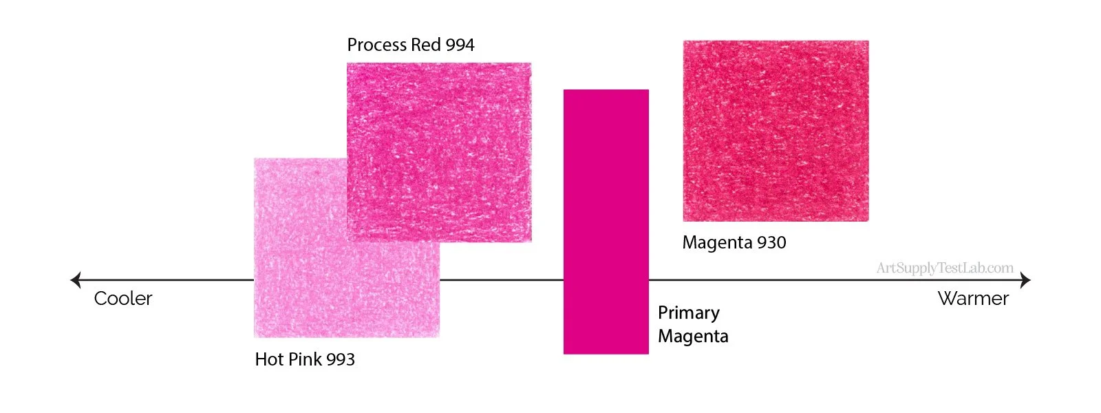
Resemblance: Hot pink looks like a diluted version of Opera Rose watercolor. Hot Pink is not florescent (Opera Rose always seems to glow) but it’s bright and sassy enough to be in that same intense family of bright pinks.
Neutralization: Hot Pink PC993 looks like white has been added to PC994 Process Red. This color is clean and clear so it’s not neutralized, but it’s still technically a desaturated color— it has been desaturated with white to form a tint.
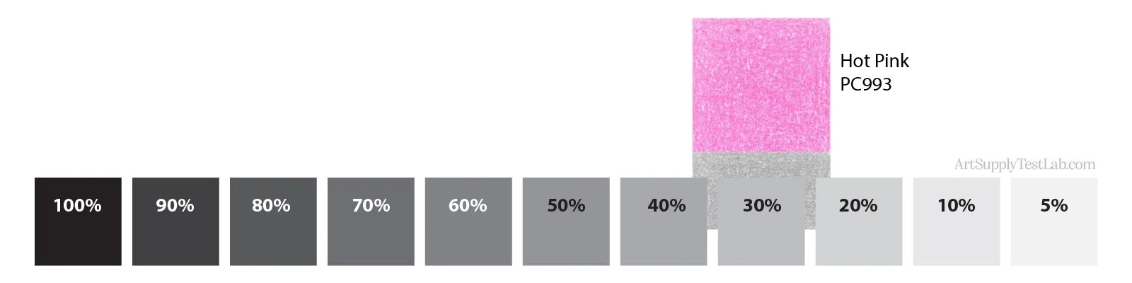
Value: Hot Pink measures 30% gray in value.
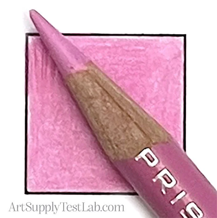
Indicator Accuracy: The paint on Prismacolor Hot Pink is as close to a match as I’d expect from colored pencils.
The photograph here looks a little off but that’s because the pencil pigment has a different reflectivity than the paint on the pencil barrel. In real life, the two are pretty darned close.
Availability: All Prismacolor Premier colors are sold open stock but not every retailer carries the entire line. Check with your retailer before travelling.
As for sets, Hot Pink is included in the 12 Botanical and 24 Highlighting & Shading specialty sets, plus the 132 and 150 assorted sets.
Buy Prismacolor Premier Hot Pink PC993
The smallest Prismacolor set containing Hot Pink is the Botanical 12-count set.
These are affiliate links. Purchases made through them help fund the Lab’s independent testing at no additional cost to you. As an Amazon Associate, I earn from qualifying purchases. As a Walmart Partner, I earn from qualifying purchases.
Test Results: Prismacolor Hot Pink 993
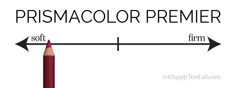
Core Firmness: Prismacolor Premier pencils are well known as one of the softest artist grade pencils on the market today. Hot Pink feels just a little firmer than average.
Oil or Wax Base: Read more about why this is nonsense here.
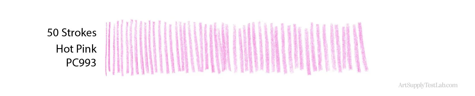
Point Retention: Like all soft colored pencils, Hot Pink does not hold a point well. It feels firmer than the average Prismacolor but the point still widened rather fast.
Starting with a freshly sharpened pencil, I lost the fine point about 1/3 of the way through and the strokes got very wide even before I got to 50 strokes. This pencil is not recommended for detail unless you sharpen frequently.
All tests are conducted on Strathmore Bristol 300 Smooth for consistency.
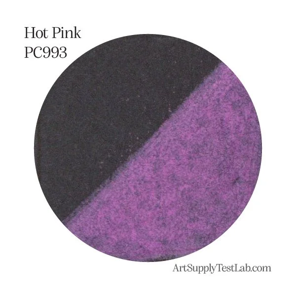
Opacity: Color opacity is one of the most important features of a colored pencil. Read why here.
Hot Pink is an excellent example of a nearly opaque colored pencil. When colored over a black swatch, to the naked eye, this pencil looks bright and vivid, doing a pretty good job of masking the black below it.
Can it fully mask the black? No, but for a colored pencil, this is excellent opacity.
This makes Hot Pink ideal for coloring on black and midtoned papers like gray and kraft.
Glazing: The opacity of Hot Pink makes it ill suited for any glazing techniques. In glazing we want to look through the glazing color to the colors below. This pencil will block the layers below it.
Masking: Opaque pencils like Hot Pink are ideal to mask or block previous layers of pencil. Because it’s such a clean and bright color, Hot Pink can be used over darker magenta pencils like Magenta 930 or 194 Pomegranate to add highlights.
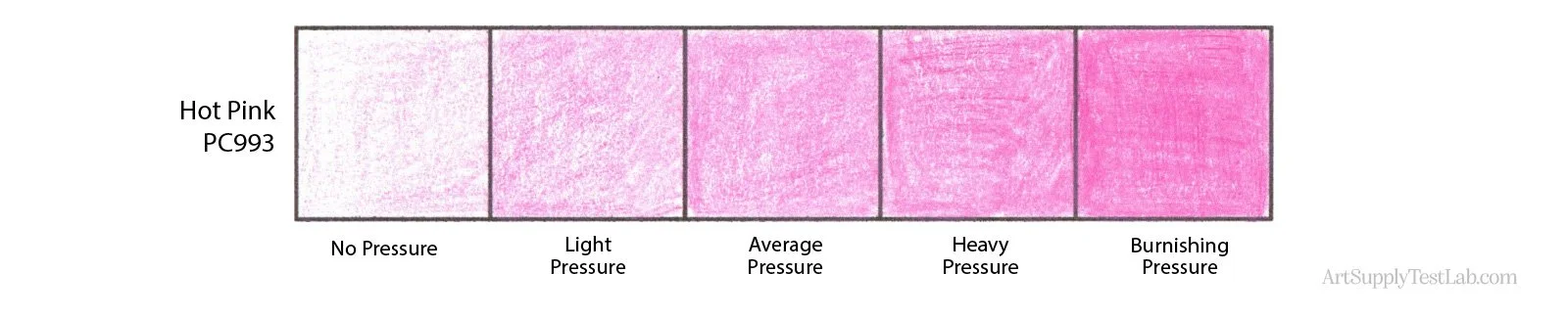
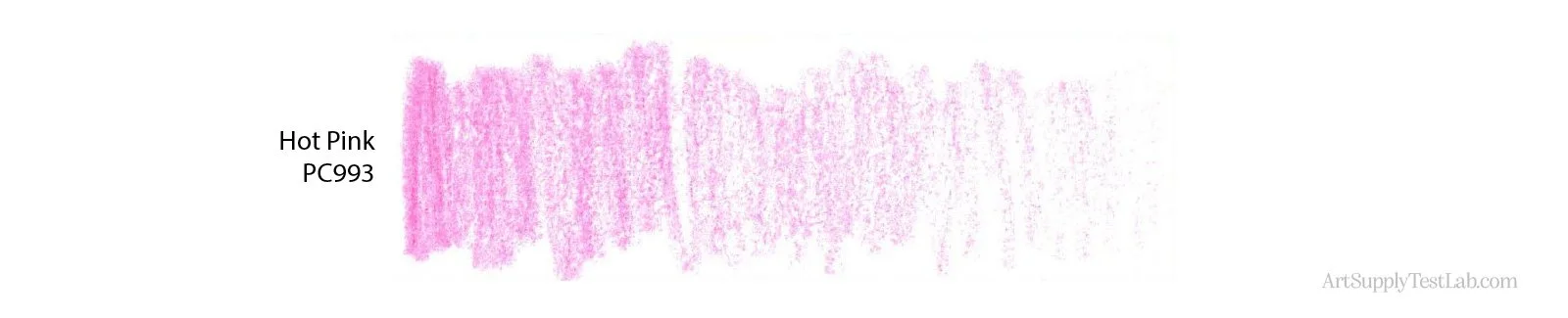
Pigmentation: While I can’t measure true pigment load without laboratory equipment, Hot Pink behaves like a moderately-low pigmented pencil.
The color builds with changes in hand-pressure (shown above) but starting at the Average Pressure, look at how visible the strokes become.
Keep reading because this is about to get worse…
This pencil feels like a cheap student grade pencil. It makes you want to press harder to apply more consistent color. Pencils should not do this.
Keep reading, it gets even worse…
Now notice what happened during the 10-Layer test where I used the same ultra-soft pressure seen in box #1 on all 10 boxes. Each box receives an extra layer of soft pressure, demonstrating how the color builds.
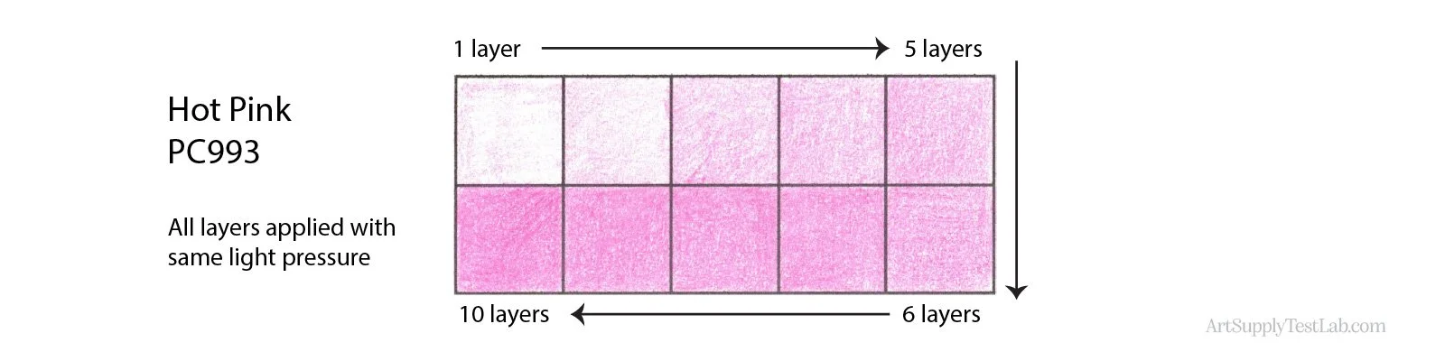
Here, Hot Pink barely leaves any color until we get to 3 layers (low pigmentation?) but then something else happens. By the time we get to 6-7 layers, the color basically stops building. We’re not adding more color from box 7 onward, we’re simply filling the tooth.
And here’s where it gets even worse…
Now take a closer look at box 10. That’s not me pressing hard or being sloppy.
Let me show you a better example of the same problem— Here’s the erasure test but don’t look at the erased area, look at the dark streaks in my pink stroke.
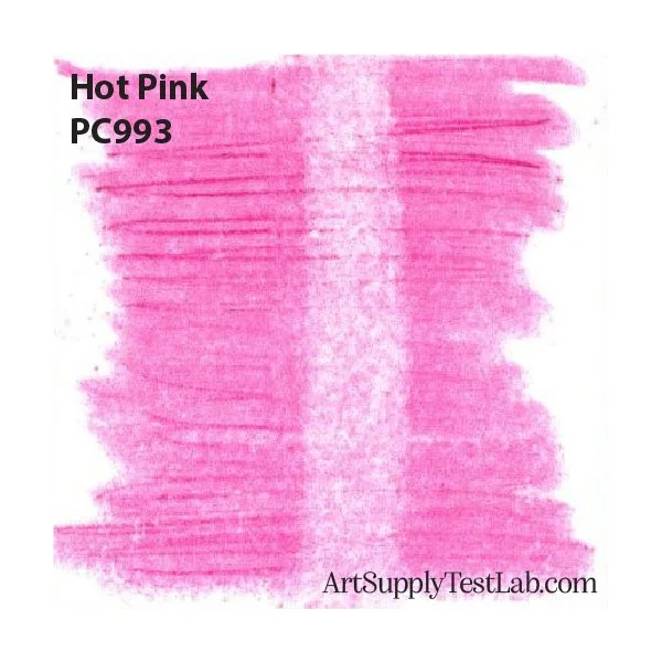
This is why I almost never use this pencil.
The dark pink streak here is a bit of hardened pigment leaving dark tracks.
Now, you might be tempted to think that this is the result of a mixing mistake. Maybe Prismacolor failed to thoroughly mix this batch of color at the factory.
But that’s not the case because this issue happens repeatedly with Hot Pink pencils purchased years apart.
Hot Pink is a chronic streaker.
Not every pencil, not every time but it happens often enough that I avoid the color.
This can’t be a simple mixing issue. A mixing issue could be easily resolved by mixing longer or changing the tools. Once resolved, the problem would never affect another batch of pencils.
There’s something unusual going on here.
Poorly mixed color would swirl around different areas of the core and yet when I sharpen these pencils, I’ve never seen a dark streak along the side of the sharpened point.
THIS IS NOT A SIMPLE MIXING ISSUE.
Instead, the flaws are seen in the center part of the core, the part we actually color with.
My husband is a Materials Engineer (MSE) with 35 years experience doing failure analysis for a major manufacturing company (not art supplies). He suspects the problem is two-fold. First, we may have irregular pigment sizes. The stray streaks are likely caused by random large pigment particles. Basically, big particles in a sea of small particles will leave dark marks. But the fact that we don’t see these particles when sharpening means we also have an issue during core formation, either during extrusion or curing.
Why Prismacolor continues to make this color, if they can’t resolve the streaking issue is a mystery.
In my own experience, Hot Pink 993 is an unreliable color which is why I avoid using it, especially at firmer pressures.
Surface Finish: Like most Prismacolor Premier pencils, Hot Pink has a satin/waxy sheen when viewed from the side but the opaque nature of the color keeps it from looking deep or glassy.
Glide: Unlike most Prismacolor Premier pencils Hot Pink is a little bit gritty. It’s missing the typical buttery smooth glide. It’s not the grittiest pencil Prismacolor makes but there’s noticeable drag.
Laydown Consistency: When applied with light to moderate pressure in even layers, Hot Pink’s laydown is fairly consistent. You may see a bit of the streaking issue but when used softly, it’s not too bad.
Unfortunately as we increase in pressure, the lower pigment load results in slightly blotchy color. And the streaking, if present, becomes more prominent.
I don’t typically recommend burnishing with a heavy hand. I prefer to build to the burnishing stage gradually in light layers. Because of the streaking issue, Hot Pink is not a good candidate for single-coat burnishing. It didn’t pill or shed but the color will not be perfectly smooth and even.
Paper Adhesion: There were no issues getting Hot Pink 993 to stick to Smooth Bristol. I wouldn’t say it lays down a ton of color per stroke but sticking to the paper was not an issue.
In fact, I specifically recommend Prismacolor Premier pencils when working on ultra-smooth or polished marker papers where adhesion is usually a problem. Prismacolor often sticks when nothing else will.
Layering Adhesion: I had mild issues getting Hot Pink to stick to itself. In the 10-Box Test above, you saw how the color failed to build. I’ve experienced worse adhesion and I wouldn’t say this was bad, I’m simply noting it.
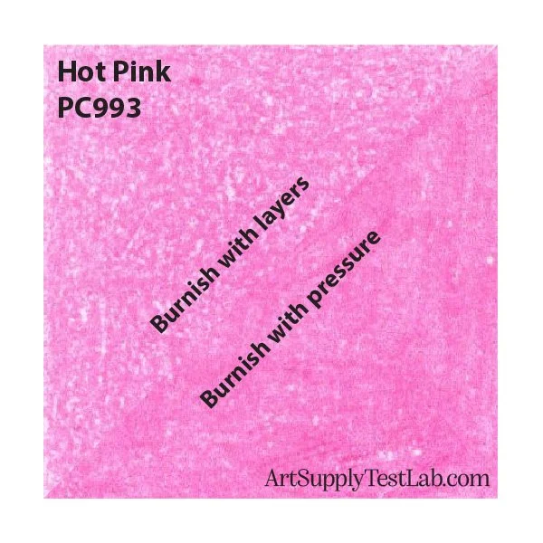
In the natural burnishing sample above, the top half triangle shows 13 moderate pressure layers which is actually very good for a colored pencil, but I had to press a little harder to make it happen. I saw no trenching but you can see one little dark pill in the sample.
There was also very little shedding with heavy pressure, Prismacolors are soft pencils so they’re not going to withstand a lot of pressure without giving way. Excellent adhesion is typical of Prismacolor Premier and Hot Pink is just a bit sub-par.
Erasure: Soft colored pencils are generally not erasable.
With 10 firm swipes of a non-abrasive polymer eraser over a pressure-burnished swatch, the best I was able to do was lift a small amount of color, one of the worst erasing brands I’ve tested so far BUT remember that soft colored pencils were not designed to be erasable. Even after firm erasing, you can still see significant pigment embedded in the tooth and the paper is permanently stained.
And note that the erasing did little to remove the dark streaking problem. Unfortunately, that’s embedded into the tooth now.
Shedding: Throughout the entire testing process, I saw very little shedding or dust from Hot Pink.
To avoid grinding the dust into your paper with the side of your hand, I recommend stopping periodically to lightly brush your project clean with a soft hake brush (Amazon) (Blick), a large makeup brush (Amazon), or a natural fiber drafting brush (Amazon) (Blick).
Point & Breakage: I sharpen all my colored pencils to a long point using the X-Acto School Pro (Amazon) (Blick).
Hot Pink was tested with this same long point. At no time did I break my lead or snap off the tip, not even when coloring with burnishing level pressures.
Hot Pink is a sturdy color which can handle firm pressure but not abuse.
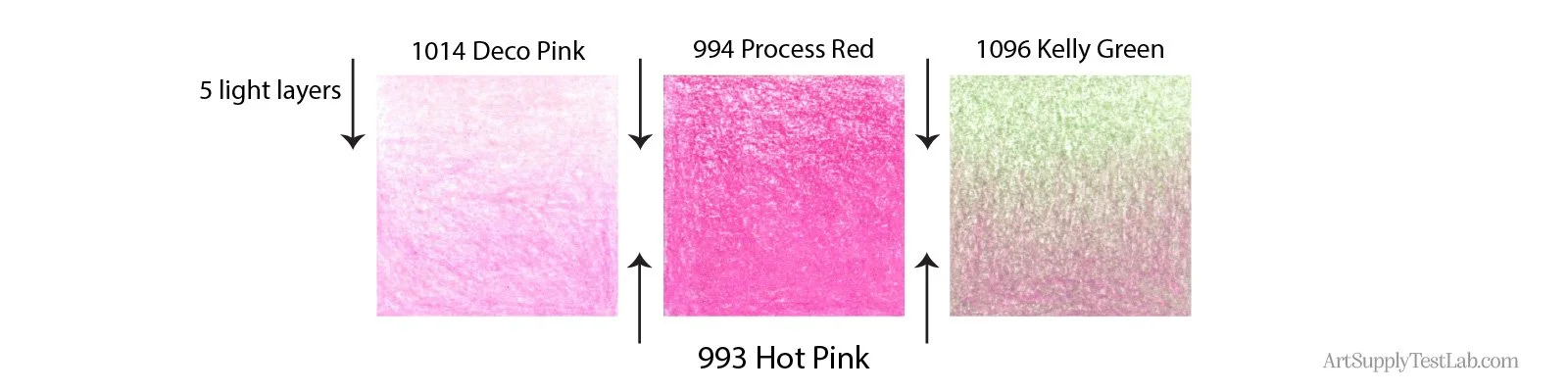
Layering: Light layers of Hot Pink were added over 5 light layers of other Prismacolor pencils. In all cases, Hot Pink proved easy to layer and is moderately recommended for layering techniques when you don’t mind the opacity blocking the color below.
Over a lighter pink: Hot Pink had a little trouble sticking to PC1014 Deco Pink. Both pencils are opaque which explains the sliding feeling and the fact that Hot Pink looks rather pale over Deco Pink.
Over a darker pink: Adding Hot Pink over PC994 Process Red acted almost like a burnishing color, muting and spreading the Process Red color.
Over a complement: Hot Pink over 1096 Kelly Green is an interesting gradient. Because Hot Pink is more opaque, the pink was able to block some of the green leading to a true pink to green swatch. A more transparent pink would have simply looked grayish and very neutralized.
Why don't we test blending? Blending results depend on skill and strategic pencil selection. It's not an accurate test of pencil quality. Read why here.
WARNING!
ASTM D6901-06 Rankings:
I - Excellent, 100+ years
II - Very Good, 50-100 years
III - Good, 15-50 years
IV - Poor, 1 year
V - Very Poor, weeks - months
Lightfast Rating: Hot Pink 993 scores a pitiful V (very poor, extreme fade) rating using certified ASTM D6901-06 lightfast testing.
See Prismacolor’s full chart with test results here.
Level V pencils are temporary colors at best and begin fading soon after you’ve finished the project.
This color is not recommended for anything more than quick journal sketches in closed books.
If Hot Pink comes in a set, have fun with it— but as an open stock color? It’s not worth your time or money.
Hot Pink in Action:
As I stated earlier, I don’t use Prismacolor Hot Pink 993 in projects. I searched through 15 years of lessons and never used it once.
Instead, here’s a sampling of my other pink projects. Each lesson project teaches realistic coloring techniques using professional markers and colored pencils.