This page contains affiliate links to trusted retailers. I may earn a commission when you purchase through these links, at no additional cost to you. As an Amazon Associate I earn from qualifying purchases. As an Walmart Partner I earn from qualifying purchases.
Colored pencils vary considerably even within the same brand. Pigment load, filler content, binder formula, opacity, value, and best handling practices can change from color to color.
Let’s test Prismacolor’s warmest red:
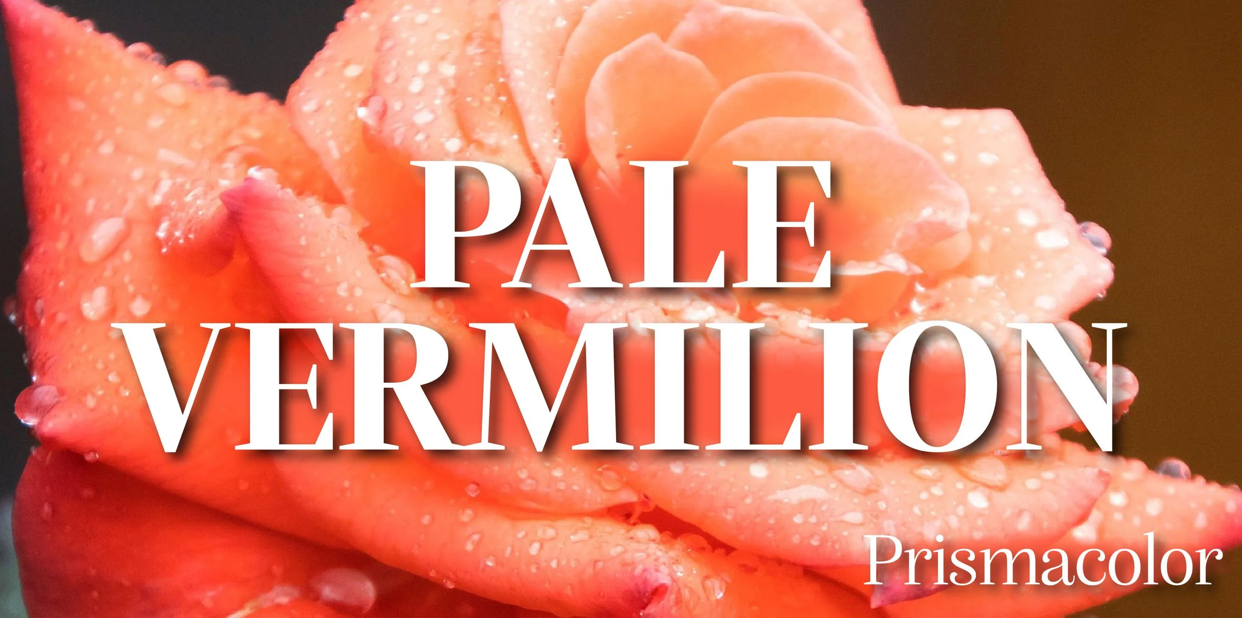

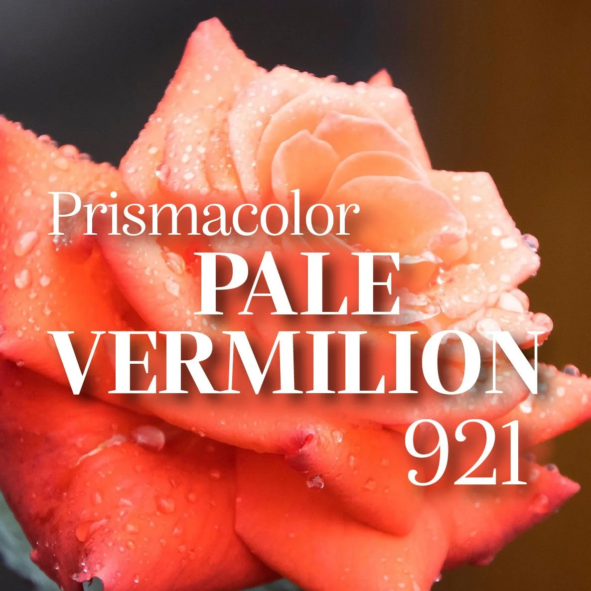
Is it red? Is it orange?
Prismacolor started making pencils in 1936 and Vermilion Red 921 was part of the earliest expansion set. Later, the color was renamed to Pale Vermilion.
This pencil is a tough color to categorize. Next to red pencils, Pale Vermilion feels like it belongs in the orange section. Move it to the orange pencil section and it sticks out as distinctly red. Pale Vermilion has a foot in both camps.
Fun Fact: Canary Birds come in both yellow and red versions. The American Singers Club uses specific Prismacolor pencils as color standards for judging red-factor canaries. ASC cites 921 Pale Vermilion as the reference for Light Red birds. 922 Scarlet Red and 924 Crimson Red are the standard for progressively redder canaries.
Let’s look closer at Prismacolor’s hardest to classify red, Pale Vermilion PC921.
Prismacolor Premier: Learn about the pencil line, sets, and how Prismacolor colors compare.
The Color: Prismacolor Pale Vermilion 921
Name: Vermilion is a brilliant orange-red pigment made from mercury sulfide. Although toxic, vermilion has been used for centuries in Chinese and European art. Prismacolor’s version does not contain actual vermilion, it’s simply meant to match a standard color artists are used to working with.
Temperature: Pale Vermilion is an extremely warm red with a orange flavor.
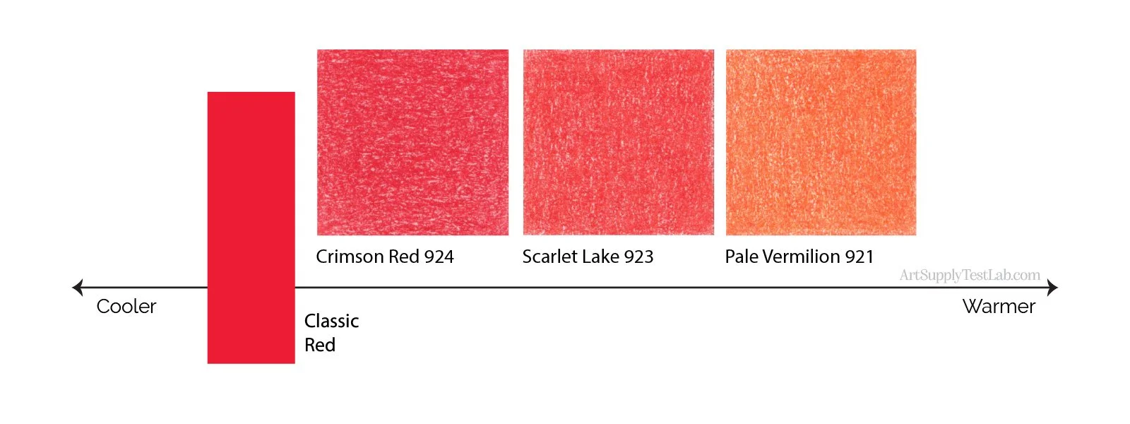
Resemblance: Due to toxicity, vermilion colored paints are now more likely to be found in the Cadmium Red-Orange section, although Cadmium has issues too. Prismacolor’s Pale Vermilion does not contain vermilion or cadmium and would be better named Pale Vermilion Hue.
Neutralization: Pale Vermilion is clean and bright, a very saturated color.
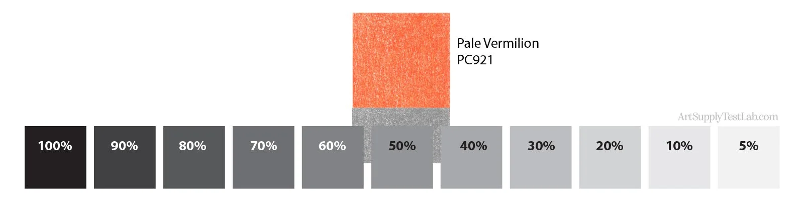
Value: Pale Vermilion measures 50% gray in value.
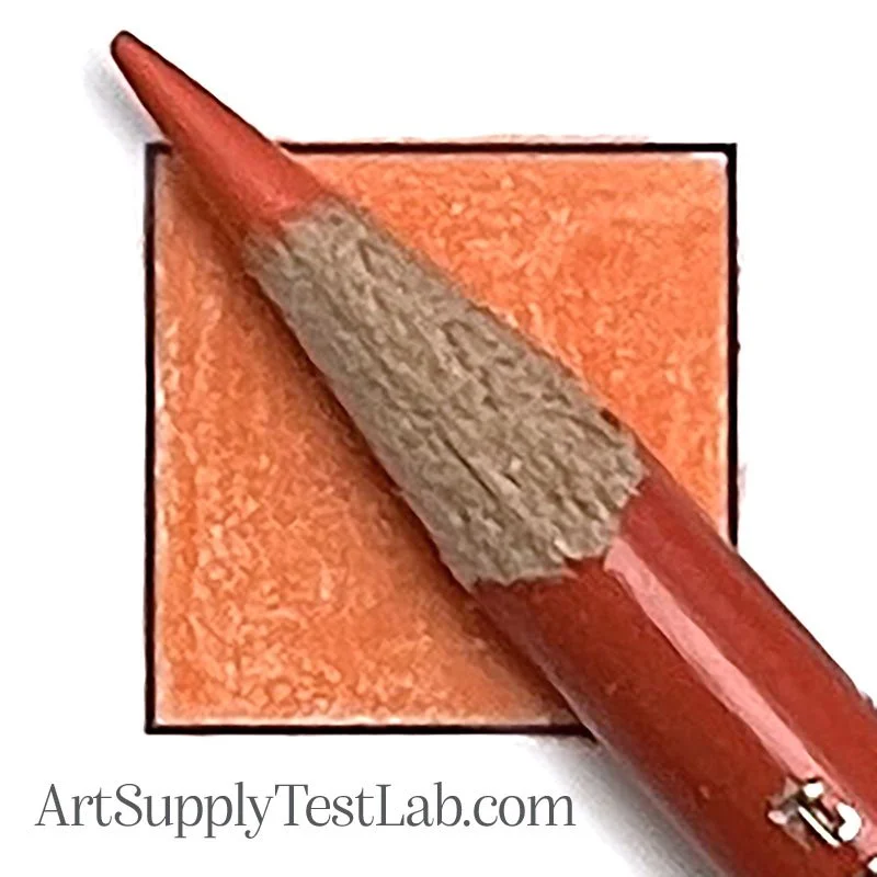
Indicator Accuracy: The paint on Prismacolor Pale Vermilion is a wee-bit darker than the fully burnished color but I’d call it an exact match.
Availability: All Prismacolor Premier colors are sold open stock but not every retailer carries the entire line. Check with your retailer before travelling.
As for sets, Pale Vermilion is included in the 48, 72, 132, and 150 standard sets. It’s also part of the Highlighting & Shading Set of 24.
Buy Prismacolor Premier Pale Vermilion PC921
The smallest Prismacolor set containing Pale Vermilion is the 24 Highlight & Shade set.
These are affiliate links. Purchases made through them help fund the Lab’s independent testing at no additional cost to you. As an Amazon Associate, I earn from qualifying purchases. As a Walmart Partner, I earn from qualifying purchases.
Test Results: Prismacolor Pale Vermilion 921
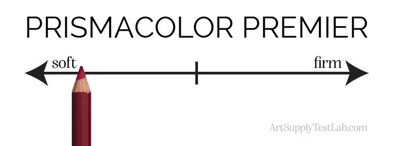
Core Firmness: Prismacolor Premier pencils are well known as one of the softest artist grade pencils on the market today. Pale Vermilion has the standard smooth softness
Oil or Wax Base: Read more about why this is nonsense here.
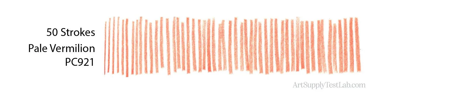
Point Retention: Like all soft colored pencils, Pale Vermilion does not hold a point well.
Starting with a freshly sharpened pencil, I lost the fine point quite early and the strokes got extremely wide even before I got to 50 strokes. This pencil is not recommended for detail unless you sharpen frequently.
All tests are conducted on Strathmore Bristol 300 Smooth for consistency.
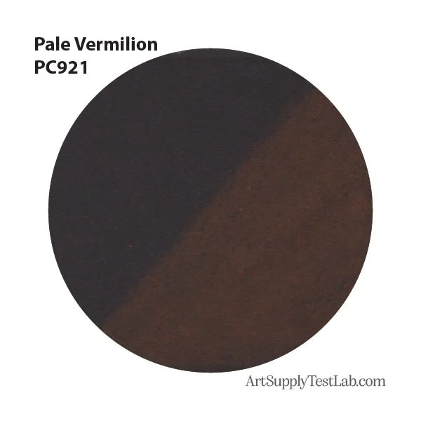
Opacity: Color opacity is one of the most important features of a colored pencil. Read why here.
Pale Vermilion is a middle-of the road pencil, it’s more opaque than Prismacolor’s usual transparents but it’s more translucent than their opaques.
When colored over a black swatch, to the naked eye, this pencil catches the light and blocks some of the black. When scanned, it looked more transparent to the scanner.
Glazing: The slight opacity of Pale Vermilion makes it ill-suited for glazing. You might get away with a light layer but too much pressure or too many layers will begin to block the color below.
Masking: As mentioned above, Pale Vermilion is only mildly opaque. There’s not enough opacity to this color to mask or block previous layers of pencil. Even if you press hard, this pencil will struggle to block prior layers.
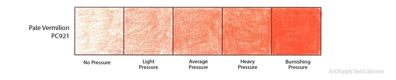
Pigmentation: While I can’t measure true pigment load without laboratory equipment, Pale Vermilion behaves like a moderately pigmented pencil.
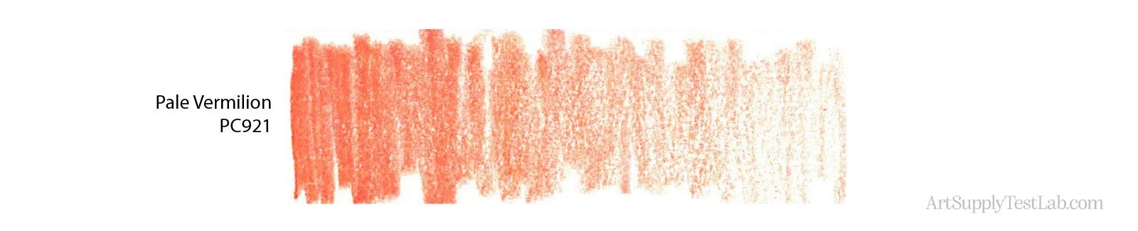
The color builds generously with changes in hand-pressure (shown above) or with repeated layers of light consistent pressure (below)
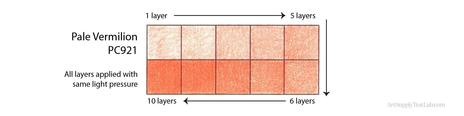
Surface Finish: Like most Prismacolor Premier pencils, Pale Vermilion has a satin/waxy sheen but because it’s slightly opaque, it lacks the glassy deep look of translucent Prismacolors.
Glide: Like most Prismacolor Premier pencils, Pale Vermilion has a smooth glide with no sand, grit, or drag.
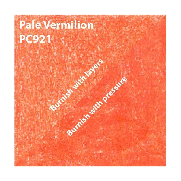
Laydown Consistency: When applied with light to moderate pressure in even layers, Pale Vermilion’s laydown is consistent with no streaks of binder or blotchy pigment.
The pressure-burnished swatch does look slightly blotchy which is why I suspect it’s not as densely pigmented as other Prismacolors.
I don’t typically recommend burnishing with a heavy hand. I prefer to build to the burnishing stage gradually in light layers. But if you insist, Pale Vermilion is a not a good candidate for single-coat burnishing. It didn’t pill or shed but the color isn’t perfectly smooth and even.
Paper Adhesion: Pale Vermilion is a soft pencil. There were no issues getting it to stick to Smooth Bristol.
In fact, I specifically recommend Prismacolor Premier pencils when working on ultra-smooth or polished marker papers where adhesion is usually a problem. Prismacolor often sticks when nothing else will.
Layering Adhesion: I had no issues getting Pale Vermilion to stick to itself. In the sample above, the area burnished with light layers (top left half) shows 15 moderate pressure layers and I saw no trenching or pilling in the process. There was also very little shedding with heavy pressure, it’s a soft pencil so they’re not going to withstand a lot of pressure without giving way. Excellent adhesion is typical of Prismacolor Premier.
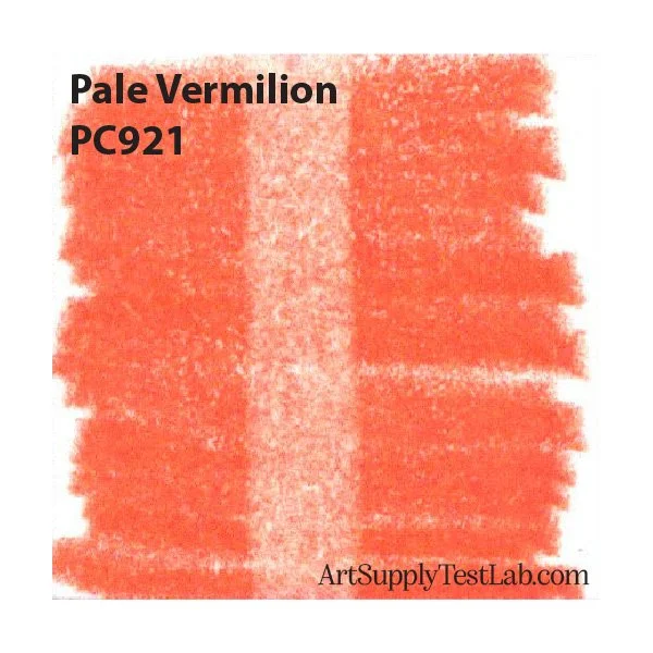
Erasure: Soft colored pencils are not generally not erasable.
With 10 firm swipes of a non-abrasive polymer eraser over a pressure-burnished swatch, the best I was able to do was lift a small amount of color BUT remember that soft colored pencils were not designed to be erasable. Even after firm erasing, you can still see significant pigment embedded in the tooth and the paper is permanently stained.
Shedding: Throughout the entire testing process, I saw very little shedding or dust from Pale Vermilion. It wasn’t completely dust-free but the shedding was minor.
To avoid grinding the dust into your paper with the side of your hand, I recommend stopping periodically to lightly brush your project clean with a soft hake brush (Amazon) (Blick), a large makeup brush (Amazon), or a natural fiber drafting brush (Amazon) (Blick).
Point & Breakage: I sharpen all my colored pencils to a long point using the X-Acto School Pro (Amazon) (Blick).
Pale Vermilion was tested with this same long point. At no time did I break my lead or snap off the tip, not even when coloring with burnishing level pressures.
Pale Vermilion is a sturdy color which can handle firm pressure but not abuse.
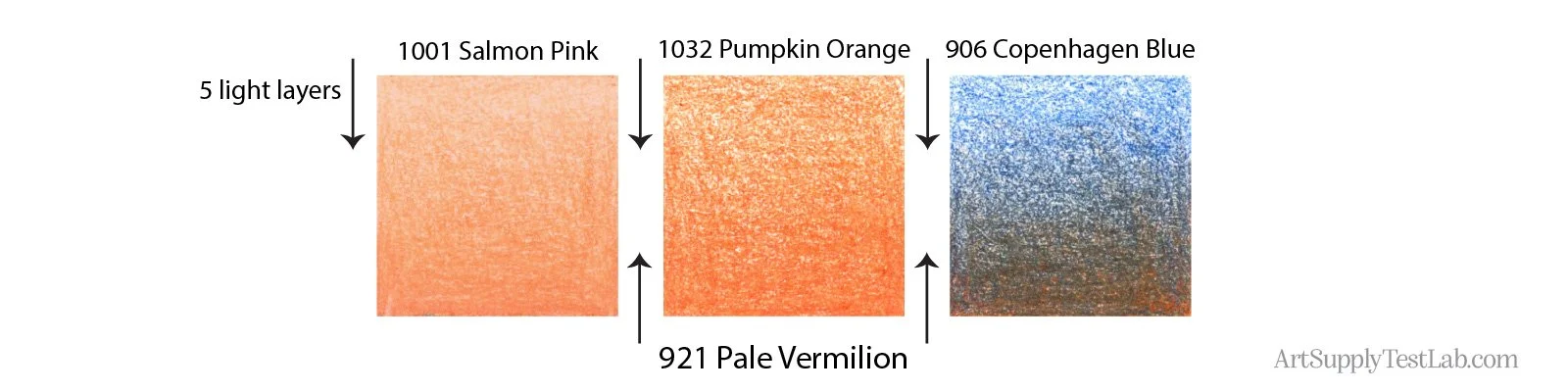
Layering: Light layers of Pale Vermilion were added over 5 light layers of other Prismacolor pencils. In all cases, Pale Vermilion proved easy to layer and is highly recommended for layering techniques.
Over a lighter orange: Pale Vermilion added a nicely coordinated darker value to PC1001 Salmon Pink. There were no issues with adhesion and no extra pressure was required to make Pale Vermilion visible.
Over a darker orange: Adding Pale Vermilion over PC1032 Pumpkin Orange felt a bit futile. Pale Vermilion simply wasn’t opaque enough to add noticeable color.
Over a complement: Pale Vermilion is too transparent to create a fully reddish orange area over 906 Copenhagen Blue. Layering complements often results in muddy color and this is pretty typical of the neutralizing effect of layering complements.
Why don't we test blending? Blending results depend on skill and strategic pencil selection. It's not an accurate test of pencil quality. Read why here.
ASTM D6901-06 Rankings:
I - Excellent, 100+ years
II - Very Good, 50-100 years
III - Good, 15-50 years
IV - Poor, 1 year
V - Very Poor, weeks - months
Lightfast Rating: Pale Vermilion 921 scores a III (good) rating using certified ASTM D6901-06 lightfast testing.
See Prismacolor’s full chart with test results here.
Level III pencils can last 15-50 years before any fading might occur.
Pale Vermilion is not a temporary color but it’s not recommended for use in artwork where you intend to sell the original for framing and display.
Pale Vermilion in Action:
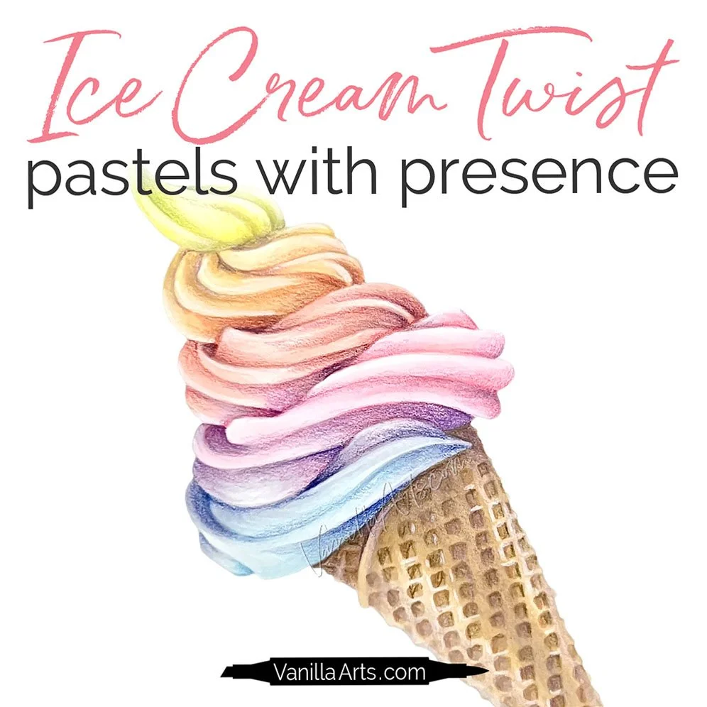
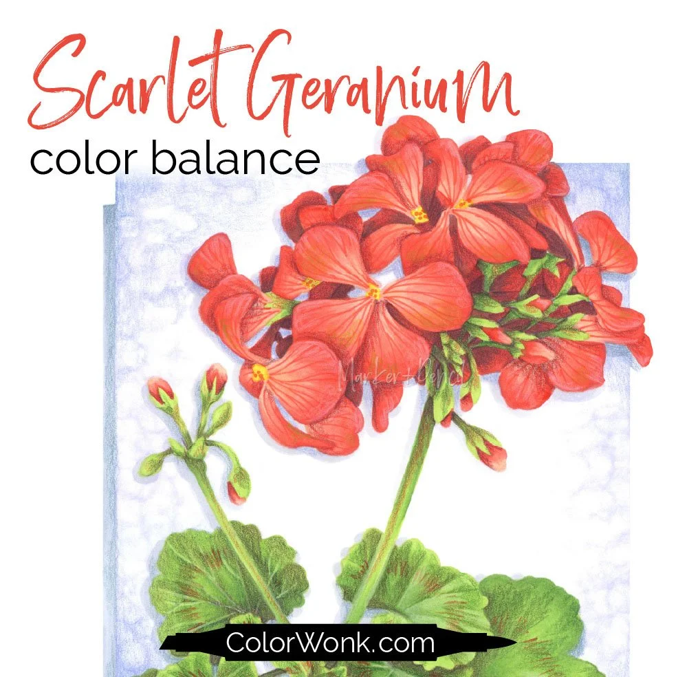
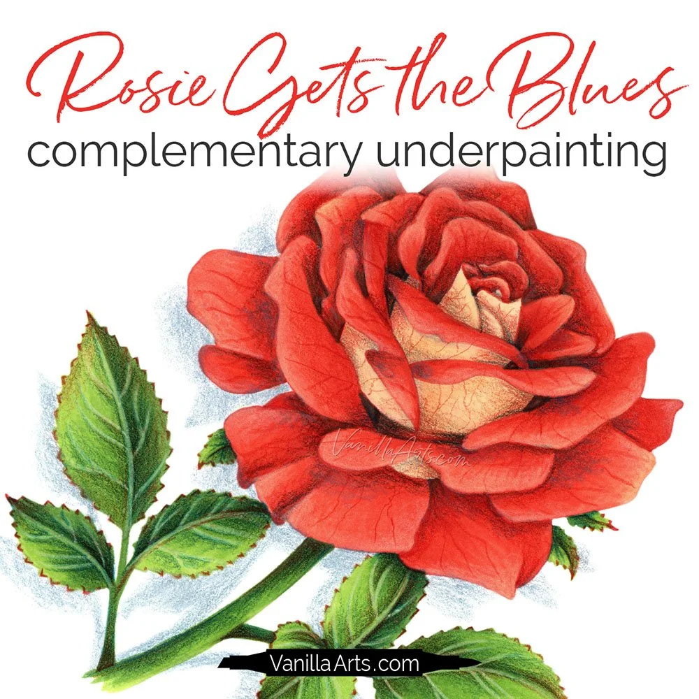
I searched though 17 years of classes and courses for instances of Pale Vermilion PC921. I was only able to find it in the Ice Cream Twist project. The two florals are projects where I can easily see using Pale Vermilion in lieu of Poppy Red.
Each lesson project teaches realistic coloring techniques using professional markers and colored pencils.